BitBakery

Figure 1: BitBakery Lab, hero illustration for the new website's home page.

UX + UI

2018


Role(s): UX Designer, Web Developer + Designer

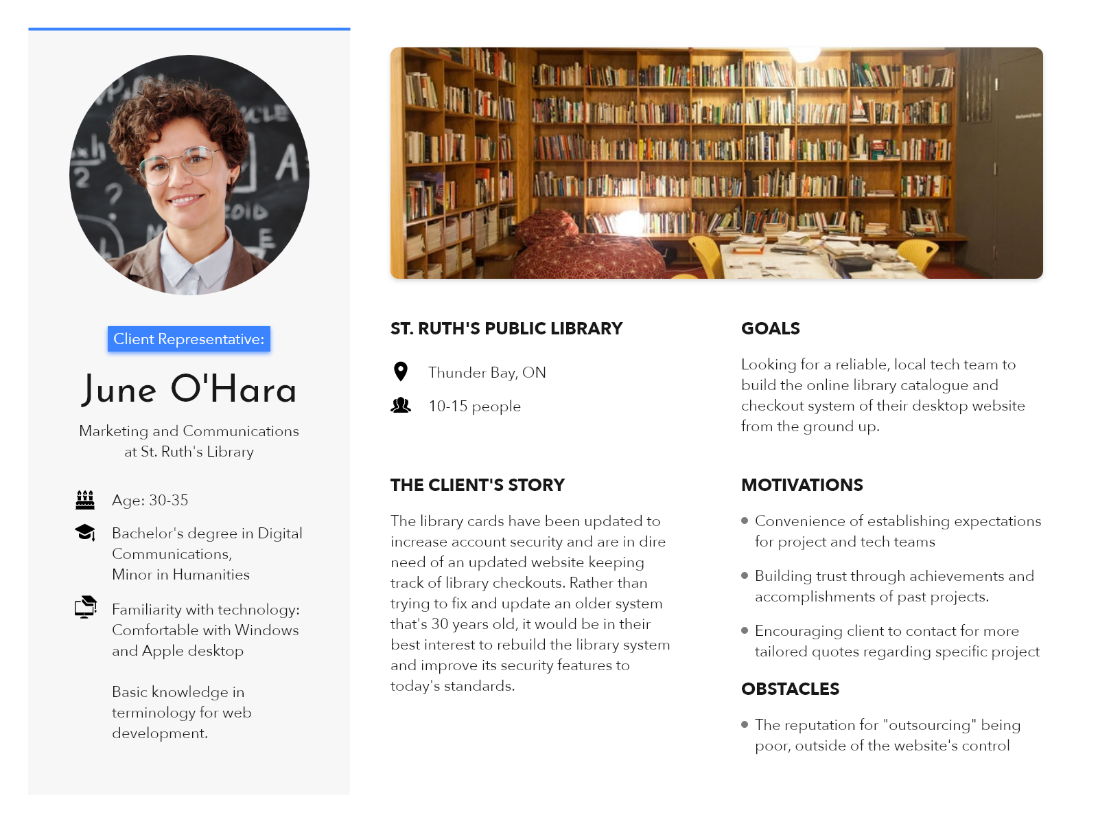
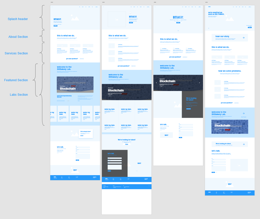
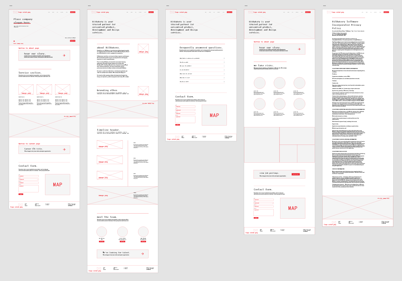
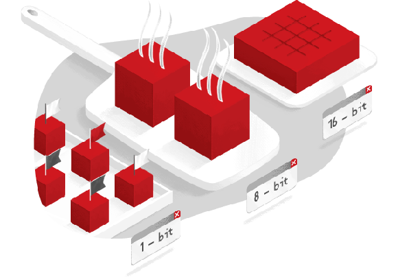
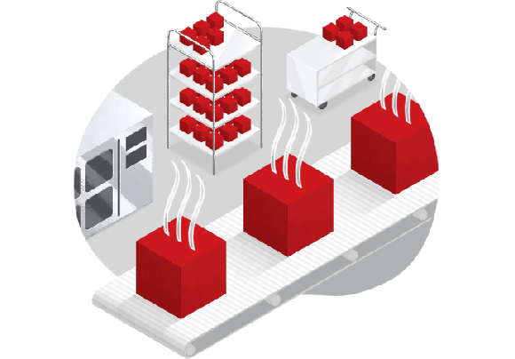
BitBakery's responsive website introduces their trusted software development services across the world; targeting clients in need of tech teams and products while looking out for talent looking to be a part of a growing team in a startup tech environment.

Scroll through the BitBakery webpage

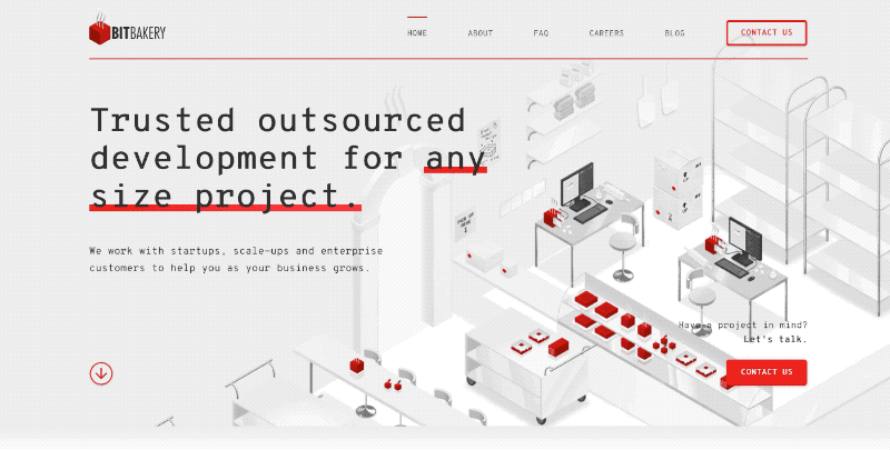
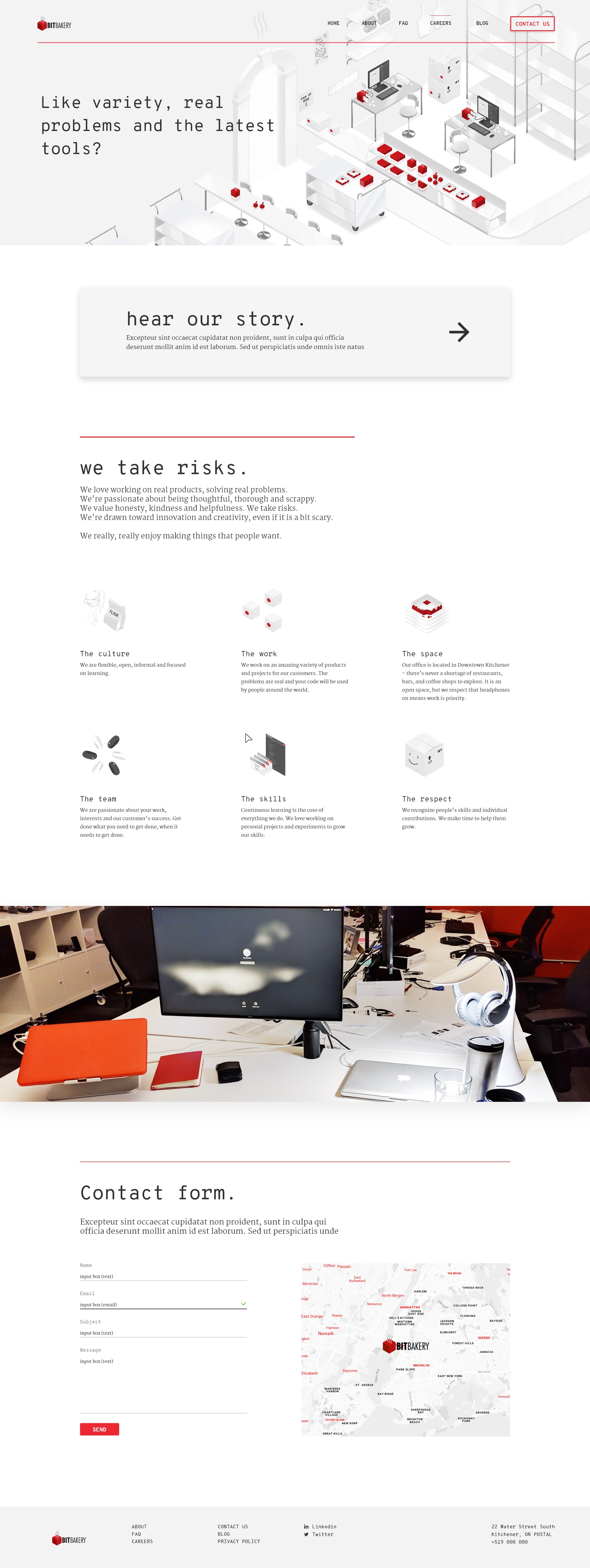
Figure 2: Scroll through the newly built BitBakery site, May 2019.

Growing Pains and Goals

As a design intern for Bitbakery, I've been given a solo mission to improve and build the company's website which previously served as a web infographic of their services.

Although I am a one-person team, I've frequently collaborated with the UX copywriter, CEO and UX director to help expand their website from being a single page infographic to an interactive platform that encourages visitors to learn about BitBakery and communicate with the BitBakery team.

Design: For Clients

Client representatives need an easy way to access the information either for quick information relaying for their respective company head or nuanced research to see if BitBakery's services are compatible with their needs before contacting.

Priority of sections to build for clients:

  1. Site Description
  2. Services Section
  3. Contact Section: Encourages the client to reach out to BitBakery quickly without an appointment.
  4. FAQ Section: Addressing questions about services.
  5. About Section

Design: For Talent

Whether recently graduated or looking to join a new team, talent have similar habits of exploring the company website, scouring across every link and social media account to look for opportunities to apply.

Priority of sections to build for Talent:

  1. Site Description
  2. Careers Page
  3. Footer with Career Link: Talent immediately scroll down to the footer to find a link to the page to apply (e.g. Careers, Jobs, Opportunities)
  4. Contact Section
  5. About Section

User Personas

User persona for a client representative.

Figure 3.1: Client persona is a representative from a company reaching out.

User persona for talent being a co-op student.

Figure 3.2: Talent persona is represented as a student undergoing a co-op program.

Prototype

TOOLS: Adobe XD, Material Design, Paper UI
SKILLS:
 Wireframing, Low & High-Fidelity Prototyping

BitBakery Prototype

1st Iteration of the Website

1st iteration website, low fidelity

2nd Iteration of the Website

2nd iteration, low fidelity

High Fidelity Mock-up

high fidelity mock up with rebranding

Rebranding

For more information regarding the BitBakery Rebranding project, there is a separate case study going into detail about world building, font hierarchy, color palettes, illustration styles and layouts here:

BitBakery Rebranding
bitbakery faq banner

Figure 4: FAQ webpage banner with red Bits.

Website

TOOLS: Brackets, Paper UI, Bootstrap, WAVE
SKILLS: HTML, CSS, Javascript, Responsive Design

Accessibility
Close X

Accessibility

Navigation menu links were expanded from the hamburger icon to allow keyboard navigation for folks with motor-restrictions.

Contrast, color, font weight, size and type are considered to accommodate visually impaired folks. Alt-text were added to images including logos so that text-to-speech readers can read aloud the text to users.

Optimization
Close X

Optimization

For fast loading, many of the images are web optimized banners exported from Photoshop. Previously, the page opens up to a video overlay splash that took about 3-4 seconds to load after everything else has.

A large logo image didn't help with the experience and tiles scattered all throughout the site used more browser power with unnecessary Javascript.

Navigation
Close X

Navigation

Navigation menu links were expanded from the hamburger icon to allow keyboard navigation for folks with motor-restrictions.

Contrast, color, font weight, size and type are considered to accommodate visually impaired folks. Alt-text were added to images including logos so that text-to-speech readers can read aloud the text to users.

Debugging
Close X

Debugging

Navigation menu links were expanded from the hamburger icon to allow keyboard navigation for folks with motor-restrictions.

Contrast, color, font weight, size and type are considered to accommodate visually impaired folks. Alt-text were added to images including logos so that text-to-speech readers can read aloud the text to users.

mobile screen previews

Figure 5: View of browsing the website on different aspect ratios and screen sizes: Tablet (768px x 876px), Phone (320px).

Screen replica of BitBakery for careers page

Figure 6: Careers page, high fidelity mockup with icons, graphics and branding in place.

Visit BitBakery Website

Conclusion

To test out the efficiency of each client and talent finding the information needed to answer the 3 key questions, a perfect setting and sample size would be at the next Communitech TechJam.

Icon one

"How did you find BitBakery?"

All party members were first directed from the website or from word-of-mouth from previous business partners. SEO has improved which contributed with more people finding the website under tech instead of a local bakery.

Icon 2

"Who is BitBakery?"

200% more people have been able to answer this question confidently and correctly contrary to the previous website.

Icon 3

"What does BitBakery do?"

During the brief interviews, about 95% of both talent and other businesses in the Communitech event were able to recall the services only a scroll away from the home page.

top

Contact Me